Chapter 6The Flow Funnel
Hypothesis 6.1 Constructing the funnel
In order to come up with a model for flow in digital tools, we will need to examine the way digital tools get us into flow. Based on the literature review described in the previous chapter, a first version of this model was constructed.
Tools don't matter, doing work does
First of all, it's important to recognise that flow stems from the process, not the tool. Using a hammer is not what makes us experience flow – it's the creation of something with that hammer. Since this thesis is about flow in digital tools in a general sense, we need to examine what process these tools enable. As discussed previously, tools are meant to help you to do work. But what does it mean to "do work"?
The exact activities that constitute work are different for everyone, but fundamentally doing work revolves around making decisions – preferably, decisions you are best equipped to make, because of creativity, inspiration, or experience. Tools aid you in making those decisions, and the tools you use should thus be attuned to your skill level and the challenge you're able to overcome, both of which will improve over time. It's this balance that creates flow.
Balancing skill & challenge
It all starts with a user. Each user of an app will have a certain amount of knowledge and skills, separated into knowledge of the domain (photography, bookkeeping, video editing, writing, ...) and interface (Adobe Lightroom, Microsoft Excel, Final Cut Pro, Google Docs, ...).
The aggregate amount of knowledge and skills a user has, decides how high the challenge needs to be in order for that user to experience flow in their work.
Each user can be placed somewhere on this range, ranging from low skills/challenge to high skills/challenge. If all other flow-inducing factors (proximal goals, immediate feedback, ability to focus) remain the same, the amount of flow a user experiences should be the same no matter where they are situated on this range.
The sense of challenge is caused by the interface. As mentioned before, the amount of challenge presented should match the user's skill level. It can do this by varying the possibilities for action that it allows the user to do at any one time.
When a user is highly skilled, the interface can be complex and allow for a large amount of actions. When a user is less skilled, the amount of actions should be reduced or at least simplified.
An interface that dynamically matches the user's skills with an appropriate level of challenge, will cause an optimal balance and bring the user into the flow channel, and keep them there. As a user's skills develop, the interface should grow with them by providing more challenge, and hence causing more flow.
This is the core thought behind the Flow Funnel model. A flow-inducing interface should scale with the user each step of the way.
Methods 6.2 Testing the funnel
In order to validate this model, I set up a small-scale study aimed at qualitatively validating the assumptions in the model. To make the questioning concrete, the domain of photography was chosen as an example to study. Users from all skill- and knowledge levels were asked to participate in one-on-one research sessions.
Each session consisted of three parts:
- an interview with open-ended questions around photography and workflow. This interview served to get the participant "warmed up" in thinking about their own practice and help me understand the prevailing attitudes and habits.
- an ethnographic observation session of the participant editing pictures in their preferred way. This most important part of the session allowed me to analyse, in detail, how the participant used the interface. By comparing them with other participants, certain usage patterns emerged.
- a concluding survey following the format set out by the Flow Short Scale (Kyriazos et al., 2018). The survey was an attempt at quantifying the amount of flow felt during the photo editing exercise.
The art of photography has existed for many decades, but it used to be a lot more difficult to practice than it is today. Photography has (mostly) become as easy as tapping a button and letting the computer slap a filter on it. This is what the vast majority of people prefer to do. It doesn't give them much flow, as it's more of a utility than an activity in itself.
But despite the technological advancement, photography is still a buzzing art form, and professional photographers still exist. Those who find enjoyment in the act of photography start deepening their skills. They learn about manual focus and exposure. They might download a camera app that allows them more fine-grained control. This causes them to research terminology and techniques. Eventually they might buy their own (analog) camera, and get into photo development and retouching.
Photography is familiar to many, yet contains a great spectrum of skill levels. This made it a great field to investigate.
In total, six sessions were conducted. Four sessions were held in person, two others remotely. All sessions were preceded by an introduction with an explanation of the research, a description of the planned activities, and a request for recording permission. All participants agreed to the research verbally and by written consent form before commencing.
In addition to the user study, two expert interviews were conducted.
- I spoke with Michael Kurz, Lecturer in Innovation & Design Thinking and Hyper Island alumnus, about the nature, biology, and psychology of flow.
- I spoke with Jasper Hauser, product designer and entrepreneur, about the design process of-, thoughts behind-, and flow within Darkroom, an Apple Design Award-winning photo editing application for iOS and Mac.
Both of these interviews were highly informative. Both experts agreed to the publication of quotes from the interviews. The most important quotes are woven into the results below.
In the analysis of the user sessions, each user was categorised into one of three groups according to their skill level: novice, proficient, and expert. The significance of these categories, together with the results of the interviews and ethnography sessions are discussed in the following section. The concluding survey will be analysed here in short.
There are few concrete conclusions to draw from the quantitative data: there are simply not enough data points — especially when measuring across such varying skill levels — to say anything definitive. The survey asked the participant to recall the previously-had flow experience and self-report, which in itself introduces the potential for recall bias and response biases (as discussed earlier). On top of that, it's possible that the questioning during the ethnographic interview influenced the participants in such a way that it either lessened their flow experience or made them more aware of their own flow experience.
All that being said, the data does show that some questions were answered more unanimously than others.
Question 1 pertaining to the skills/challenge balance, the core prerequisite of flow, was answered with very low variance. This might suggest that every participant experienced some form of flow, or at least felt the interface matched their skills. The variance increases as the questions go on, and the mean trends down. This may indicate that some users perceive their (flow) experience differently, as some report many proximal goals or a high sense of control, while other report the opposite. Especially questions relating to importance (11, 12, 13) evoked a higher response from expert users: they seem to experience higher stakes in their work.
All in all, the most valuable part of the sessions proved to be the ethnographic observation. The various actions, patterns, and quotes were abstracted into distinct user "styles", each of which has different attitudes towards the interface and a different ideal means of being challenged or guided along. The different user styles along with the suited interfaces are detailed below.
Results 6.3 The Flow Funnel
The invisible interface Directors
At the top of the Flow Funnel sit people who have little experience with the interface and the subject matter in question. These are novice users.
Who they are
For the purposes of the model it doesn't really matter whether they lack understanding, capability, time, or interest — key is that they are at least somewhat unfamiliar with the concepts the interface might deal with.
I have a lens and I have a button. Those are the only two criteria I have for my smartphone photography.
Contrary to stereotypes, it should be noted that novice users are comprised of all ages and education levels. Everyone starts out as a novice, and no one can be an expert in everything. There are plenty of users who are "novice by choice", simply because they do not care for the interface or the value it provides enough to deepen their skills.
It's about convenience. I'm not an expert. The things that the stock app lets me improve about my picture are enough for me.
Novice users might pose a difficult user to empathise with, as they are far removed from the designer's mindset, who is most likely deeply familiar with the interface and its subject matter (as discussed earlier, professional deformation is at play here). As such, plenty of user testing and honest feedback is advised.
Sadly it's not a science, you can't use the scientific method beyond working very iteratively and being open to feedback. We trust our intuition a ton – particularly feelings like "this is too difficult, too abstract" or "I don't get it". It's difficult to do that, because the longer you are embedded in this subject, the higher your tolerance to complexity. That's also why most applications become more complex over time. We're hyper-aware of that, and we try to actively combat that growing complexity.
How to get them in flow
Novice users are best served by an interface that lets them assume the role of Director: they simply describe what they want or need, and the computer "pushes the buttons" for them. The ways to serve director users harken back to the "No UI" principles discussed earlier: removing complexity from the user by understanding the user's context and leveraging artificial intelligence in smart ways.
For the most novice of users, this can mean literally telling the computer, in natural language, what they want it to do. Examples of this are voice assistants like Siri, Amazon Alexa and the Google Assistant.
Another common convention to accommodate directors is the use of "magic" buttons such as the Auto Enhance button present in many photo editing application, which analyses the photo and tweaks it in such a way that it looks better — all with a single button press.
Create a landscape with green hills and a blue sky.
Now add some trees to the hills.
Add a river running through it.
It's important to understand that a singular interaction with these automatic systems does not create a sense of flow. Rather, the system and the director should be able to enter a conversation of sorts, with the computer answering the user's query, and the user responding by indicating tweaks to the presented result.
If the system is smart enough in its interpretation of the query so as to not draw attention to the interface itself, flow could arise. The creative process happening in their mind alone might create flow.
In the photography interviews I conducted, even novice users disagreed with the computer sometimes. After all, the user might be novice to the interface, that does not mean they are devoid of opinion. They entered a "dialogue" of tweaking the picture with easily understood sliders.
I throw on the autocorrect [in the stock Photos app]. 8 out of 10 times I prefer what the computer suggests me, 1 out of 10 times I prefer it unedited, and very occasionally I make my own balance.
The difficulty isn't the editing, but choosing which edits to make.
Another version of this conversational convention comes in the form of "wizards" and onboarding screens. Instead of answering a question posed by the user, the interface presents questions for the user to answer – setting things up in the background.
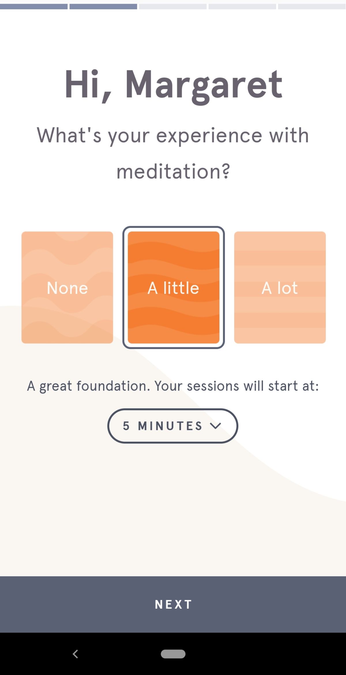
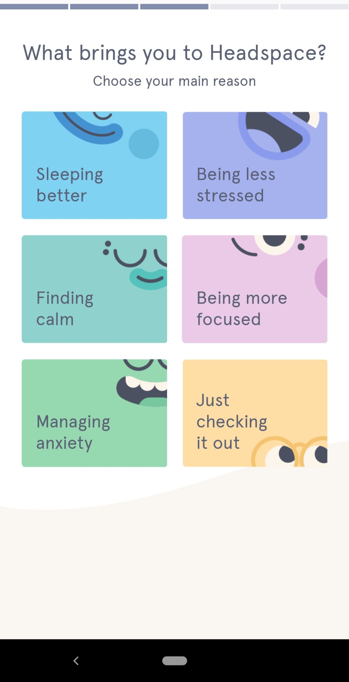
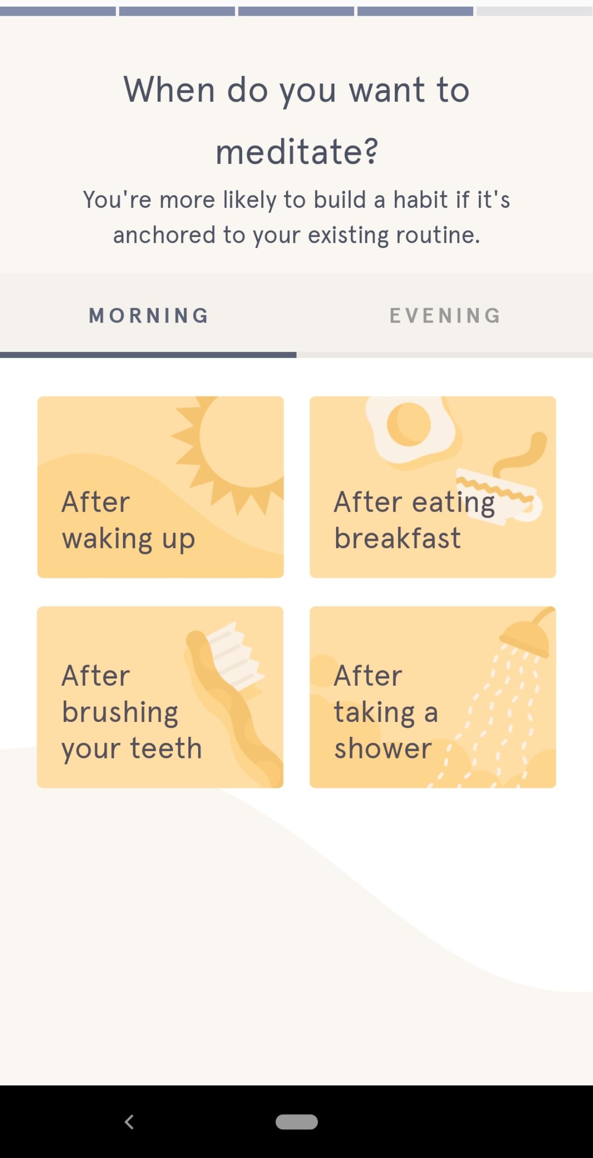
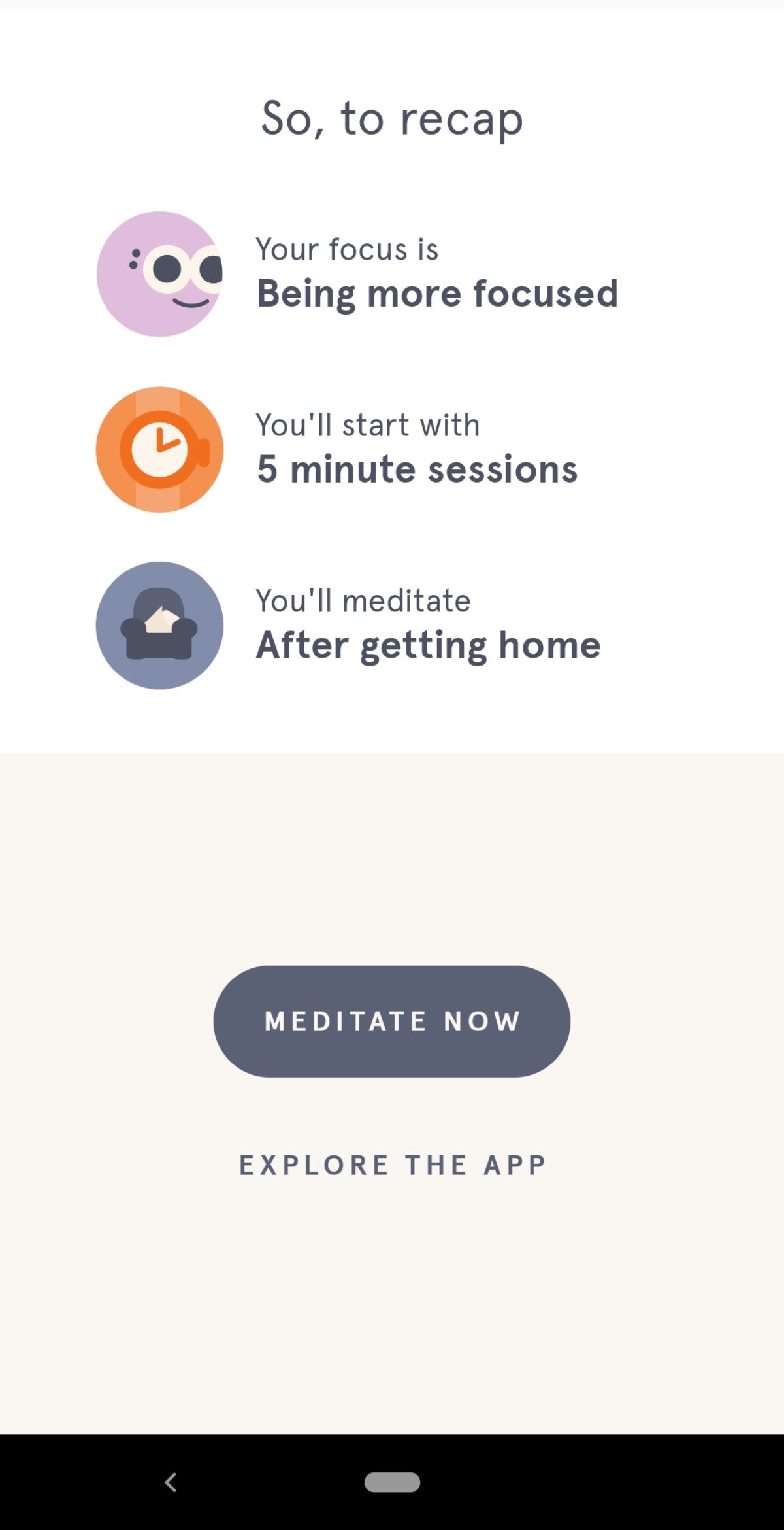
One step further down the Funnel, beyond the fully automated "do-it-for-me" interfaces, are guiding interfaces that teach the user how to do tasks themselves, and help the user along the way.
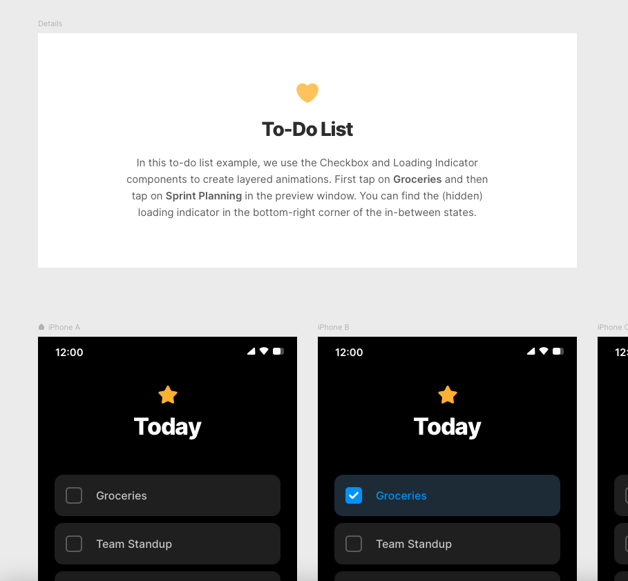
Examples of guiding interfaces are the follow-along tutorials in Evernote (Gokce, 2020) and the example files in Framer that provide a baseline for the user to start tweaking. These interfaces help improve a user's skill level, allowing them to take on greater challenges. However, they might teach users the wrong conventions. As such, it's important for these interfaces to be clear, uncluttered so as to be comprehensible, and free of jargon.
The visible interface Makers
Presuming that the interface is able to cause flow for novice users as per the upper part of the Flow Funnel, over time the user's skills will improve, and they will need greater challenges to stay in flow.
Provided they feel enough affinity with the domain, the autotelic nature of flow combined with the emergent motivation stemming from proximal goals that arise from the interaction with the interface, will cause the users to seek out these challenges themselves. This growth was expressed by some of the "novice user" photographers.
Whereas I used to take a quick phone snapshot, now I experiment with zoom level, portrait/landscape, compositional stuff.
I've mastered the basic skills, so now I'm starting to experiment with composition and more artsy techniques.
These novice users will slowly transition into proficient users: they have used the interface enough to understand most parts of it, and are able to use it to reach their goals without guiding features.
Who they are
These users are more enthusiastic about spending time with the tool, as there is intrinsic motivation and interest that keeps them coming back. They start developing their own mental model of the tool and its possibilities.
Often I have an idea about what to do with a picture or setting before I edit them. After getting warmed up with a few pictures I usually get a feel for the setting – I get in the flow of shooting them, basically.
Though they have a more stable footing, there can still be a lot of lingering doubt. These users doubt their own skills, and the workflows they've learned themselves. While they understand the capabilities (and limitations) of the tool better, there are often still questions around the "intended" usage of the tool.
I felt very much in flow, I didn't notice time passing. Something like this is both super easy to get into and simultaneously so difficult because I keep doubting myself every step of the way.
This is what makes me feel that I'm not a professional photographer... it works, but it doesn't feel like it's how I should do it. It's too primitive, too easy. I just use the features that I "happen" to know.
I don't really know what makes these two features different from each other.. or if they even are
How to get them in flow
Proficient users assume the role of Makers: they want to feel in control of the interface, and feel productive. The "No UI" principles fade slightly here: a maker can't do its job when the interface is entirely invisible. Instead, the interface should be present, but transparent and non-intrusive.
Because they start developing their own mental model, makers might start paying less attention to the guiding features that directors need, or even feel annoyed by the perceived slow-down these features cause. The use of guiding features should thus be reduced, and be more contextual. An example of this would be tooltips, which briefly explain how to do something without breaking away from the current context.
Instead of the computer taking them by the hand, the interface should assume the role of a collaborator or an assistant. Instead of the generalist conversational interfaces seen with users who don't know what buttons to press, tools aimed at makers often use "lighter", more specialised applications of AI, such as the previously-mentioned recommender systems that make proactive suggestions in key places to speed up work.
I tend to leave a lot up to the camera to decide, aside from looking out for the right composition and light conditions and stuff.
But the computer's recommendation are just that – recommendations. Even more than directors, makers are prone to strike up a "dialogue" with the AI – deviating from its suggestions.
In this case I highly disagree about the correct white balance here.
An example of a transparent "assistant" interface is the Frames tool in Darkroom: when picking a frame around the photo, Darkroom presents a number of colours that are present in the picture. This interaction is so seamless that it doesn't distract the user from the task at hand: editing the picture to perfection. Another example is Lightroom's "auto crop" feature, which automatically tilts the picture such that it's angled straight in all three dimensions. This is usually difficult to do by eye.
Contrary to directors, who might be overwhelmed or distracted by a large number of tools and possibilities, makers want to have some of that complexity in order to feel productive. They are more accepting of "manual" tinkering and friction; sometimes this is even a part of the appeal of a tool.
Spotify made me stop hand-crafting my music discovery for the sake of convenience. Manual photography made it way less convenient to capture moments, but that made it more deliberate at the same time.
These users like using keyboard shortcuts and secondary interaction patterns (such as right-clicking or long-pressing) in order to call up context menus. These types of shortcuts and menus are invisible upon first inspection, but those who know where to look make good use of it.
I really enjoy the quick switching between original and the edited version using the keyboard. That instant feedback of my changes is really nice.
(My camera) has more buttons to quickly change settings, as opposed to having to dig through menus
This took me a while, but.. if I press L it'll hide the interface and show me the photo on black, which allows me to judge the colours more accurately.
Lastly, an important aspect of the maker's flow is experimentation. Users of all skill levels experiment, and proximal goals are an important cause of flow in all accounts. But whereas directors might experiment more wildly (since they have little familiarity with what is and isn't possible) and conceptually (since they are less capable of acting upon these ideas, given their limited possibilities for action), makers practice a type of informed experimentation by testing the capabilities of the features at their disposal, using the knowledge and the mental model they've built up.
Informed experimentation was the defining behaviour in the ethnographic observation of makers.
Sometimes I use saturation instead of the colour sliders, but saturation is applied globally and I didn't want it to become too colourful.
I like adding a bit of texture to photos with people in it — it highlights stuff like hair and fabrics. Usually I just do this by feel.
[Jumping between Detail, Color, and Effects panels to edit the picture holistically] — "All these settings influence each other in a way
I tend to start out with exposure, but I can't give it too much because it'll cause too much grain..
Experimentation causes proximal goals and thus, flow. But it is exactly this experimentation that can make directors-turned-makers to feel unsure of their own capabilities.
Sometimes I just don't know what possibilities there are with a picture. I'm still exploring every slider and seeing how it affects the picture, instead of knowing "this setting should be at that value to look good".
There is a real balance to be struck between providing enough information to allow for confident, serendipitous exploration, and enough shortcuts to work more efficiently.
The known interface Architects
In its hypothesis phase, the Flow Funnel spanned from directors to makers. However, after conducting the interviews, the need for a third tier emerged.
After spending many hours with a tool, proficient users had grown into expert users: not only are they able to navigate- and use the interface to reach their goals, they actively (re-)shape the interface to fit their workflow.
Who they are
Expert users are highly motivated to use the tool. While many of them are (paid) professionals who are (at least in part) motivated by financial incentives and efficiency, hobbyists too can be experts and intrinsic motivation still plays a large role in the continued use of the tool.
Because they have put in lots of hours, they are often highly appreciative of the craft itself and the amount of detail that needs to put in to create something extraordinary.
Taking pictures with a phone there's nothing you're going to change. You're just going to put the phone in front of you and take the picture. But with a camera you need to check all the settings in order to understand "this picture is going to work". It's not going to work automatically, you need to adjust settings. I needed to study a lot for that.
I feel like Lightroom is way better than smartphone apps, because with the apps you're just using a filter and not really creating something
I don't use presets.. It makes everything the same, and every photograph wants to be something else.
I think one of the dangers of Lightroom is that it's easy to become a bit lazy in your editing, for example by copying a lot of the settings between pictures. I really like the precision that my current process affords.
The skills of these experts can generally be described as "T-shaped" (Korolev, 2018) — they have wide, generalist knowledge of their field, as well as deep, specialist knowledge of a focus area. For example, in the interviews, the expert photographers I spoke to had a clear preference for the type of photography they liked to practice, as well as a personal style.
Whereas proficient maker users employ informed experimentation, these expert architects have so much domain knowledge that they know which changes to make in response to a problem.
See how these lines aren't straight? I shot this angled slightly downward, so I need to slant the picture to compensate for that.
When you put up the green like this it becomes really fake, so I like putting the saturation down a bit so it looks more real.
Now I start comparing the picture to the previous one, visually matching the colours and brightness. This one's a bit brighter, so I need to tweak the contrast and shadows a bit by eye. You can see how copying settings from one picture to the next doesn't really work.
While there are still plenty of proximal goals that arise over the course of this process, they don't need to experiment around as much in their efforts of reaching these goals. They just know what works.
I know exactly what values I usually like, so I can easily input the numbers here
I set the values for this tool years ago, and kept them ever since
When I begin with a set, I use the first picture to set the tone for the rest of the set, by choosing the basic settings (like temperature, saturation, etcetera) and use that as a baseline. Very rarely do I change that baseline later on.
I always put the highlights down and the shadow up. That's usually what works.
How to get them in flow
Expert users know the interface to such an extent that it becomes an extension of their mind, akin to how the brain starts treating physical tools as extensions of the body (Maravita and Iriki, 2004). In philosophy, the extended mind thesis (Clark and Chalmers, 1998) reasons that our mind is not just present in the body or brain, and that even notebooks or computers can house information that we consider "part" of our memory or understanding of the world.
To function as an extension of the mind, the expert's interface should conform to the user's mental model and focus area. While this could technically be done automatically, it's likely impossible to optimise an interface perfectly for every person. The solution is for the interface to let the user assume the role of an Architect and design their own system.
Architects' interfaces should be fully "opaque" — in contrast to the invisible or "transparent" interfaces discussed earlier: they should be predictable, understandable, and malleable by the architect. The guiding UIs and recommender systems that work great for directors and makers are less useful here. Buttons that shuffle around intelligently have the potential to kill muscle memory, and proactive assistants are most likely to get misalign with the current task, get in the way, and thus reduce mental momentum.
Architect's interfaces can be visually complex, but they aren't required to be. Sometimes, a simple system speeds up mental momentum and allows the expert user to get work done faster.
At first glance, these simple interfaces can look similar to those used by directors. But where the director's interface may be visually simple, it's powered by smart algorithms, AI, and tutorials to guide the user. By contrast, in the architect's system it is the user who supplies the smartness and domain knowledge, such as understanding which pictures are worth keeping.
I don't use an organisation app like Lightroom, my current system is simple but it works. All I need are the miniatures of the images I shot. I remember the images I shot so vividly that I can usually recall which shots were worth editing.
To allow the architect to fit the interface to their needs, the interface must be customisable by design. In its simplest form, an interface could allow its elements to be moved around as the user sees fit. MacOS has a built-in system that allows the user to customise the toolbars of most built-in applications. Another example is the "Ribbon" toolbar in Microsoft Office apps, which consists of sections with buttons that can similarly be toggled or moved around.
A more complex version of this customisable idea comes in the form of modular interfaces, wherein the various functions of the application are captured in small windows ("panes" or "modules"), each of which can be placed somewhere in the app's interface. Adobe apps such as Photoshop and Illustrator use this pattern to allow users to access an enormous amount of functions in very little space. It also allows the users to set up their workspace in a way that makes sense with their workflow.
Next to being customisable, an architect's interface is also extensible. Especially in a professional workflow, the tool might not encompass the entire workflow. For example, a photographer's workflow includes camera software, photo importers, and production software. The app should thus "play nicely" with other applications and make its data accessible through APIs, plugins, and extensions.
You can do so much more with the software than I do, but I make sure that the analog picture shot in the studio is already mostly correct, which saves me time in post.
In addition to allowing other apps to cooperate with yours, extensible design also allows the user to build new functionality.
I made my own Color Balance filter previously, to make the purple colours in this set stand out a bit more. So I'll import that here..
Microsoft Office includes macros that allow users to manipulate their files using recorded steps. Photoshop has a plugin system and a way to record manipulations and re-use them later. Framer features a database of user-contributed components, each of which adds new functionality to the document.
Overview and Conclusion 6.4 The funnel completed
The Flow Funnel details the needed balance between a user's skills and an interface's challenge.
A user's skills will develop as more time is spent with the interface. Novice directors turn into proficient makers and, given enough time and motivation, into expert architects. As a user's skillset grows, they will develop a focus area that will limit the parts of the interface they care about.
An interface's challenge should scale up or down to match the user's skill level by varying the amount of complexity through the possibilities for action that the interface allows. The interface should always present a safe starting point, a familiar part of the interface from where the user can venture out, and to which the user can return in case of confusion.
Various interface conventions can be used to provide the appropriate amount of complexity for each user level, some of which have been described. These conventions flow into each other and are continuously changing as digital interface design develops. Their implementation details are highly dependent on the exact tool and its purpose.
The complete model is pictured below.
